NI
Visual Language
NI is a test and measurement company known for their integrated hardware and software systems used by engineers across the world. Our client had recently completed a rebrand, and we were brought in to workshop and build upon their existing identity. We designed a timeless visual language that emphasizes their software capabilities.
Our Approach
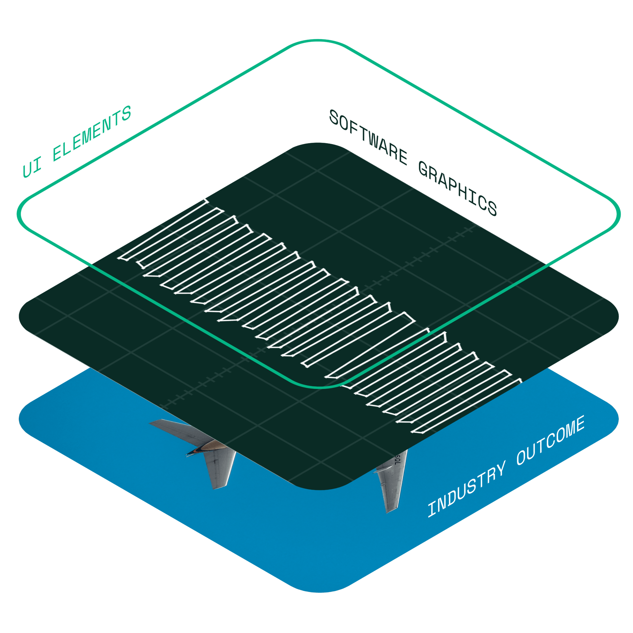
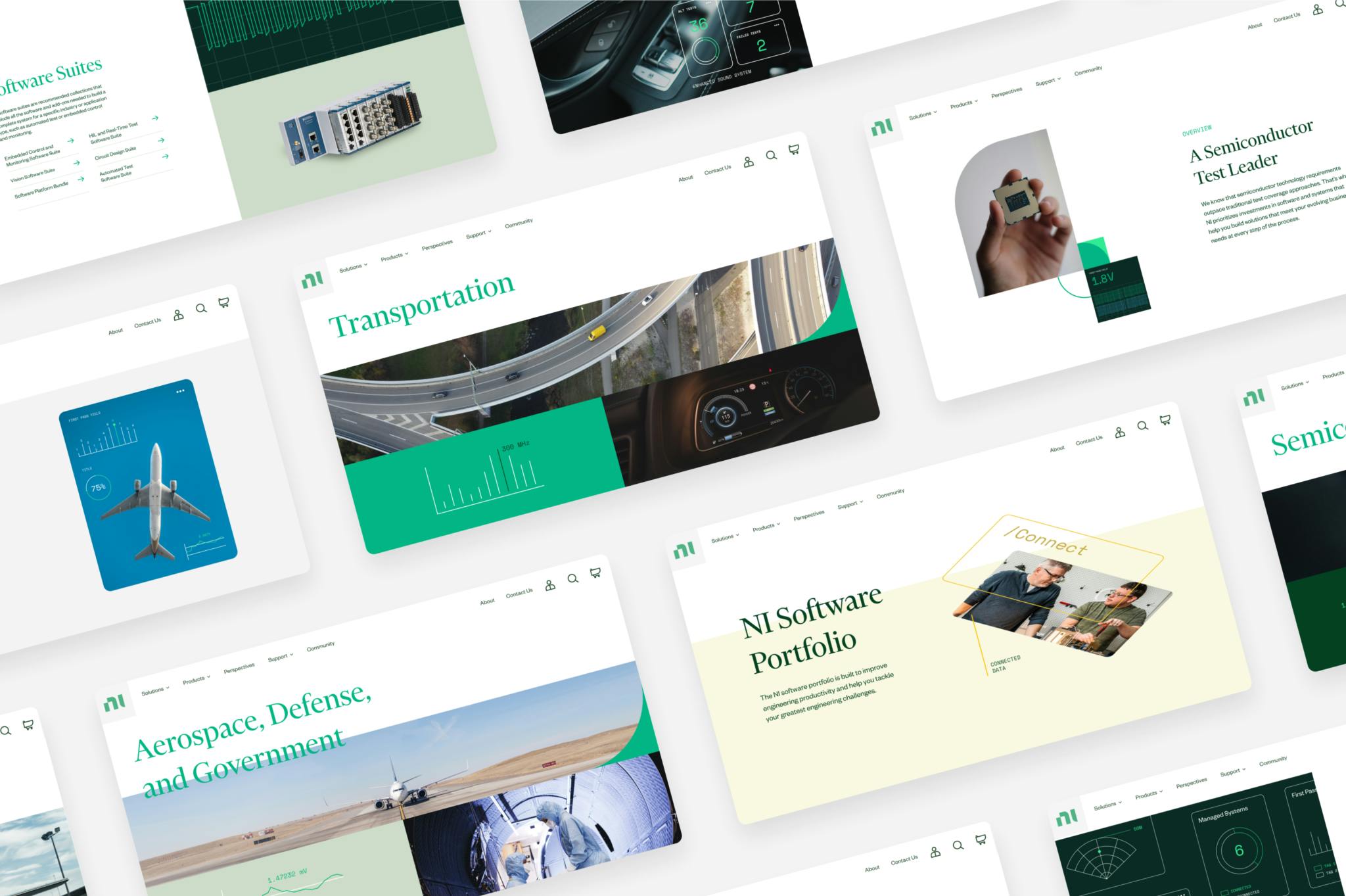
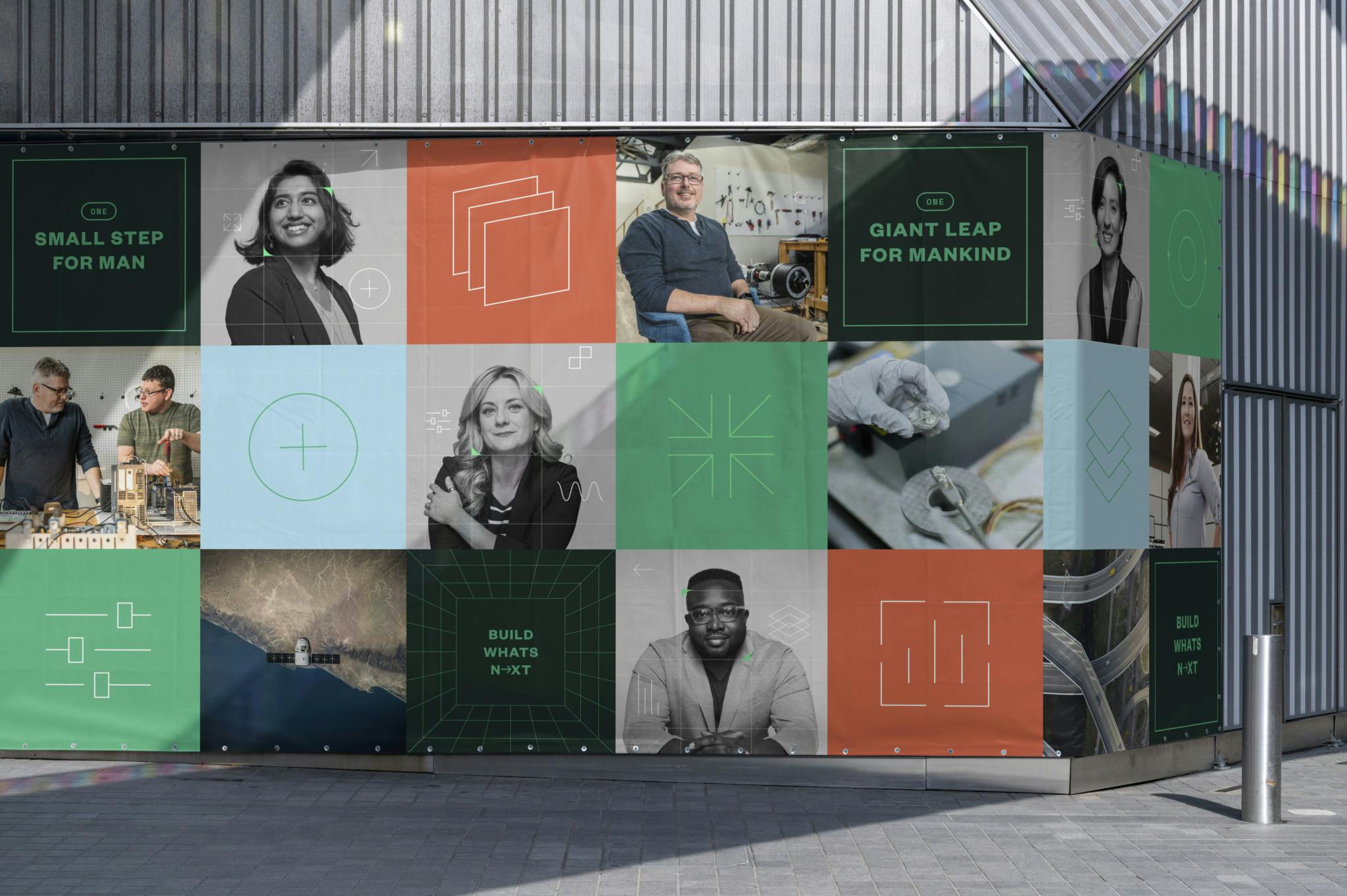
Evolving their current brand system, we combined abstract UI elements and software graphics with industry photography to create new relationships between “what they do” and “why they do it.” The system is made up of a kit of parts, combining the software challenge to the product outcome, through overlays, tiling and dimensional graphics.
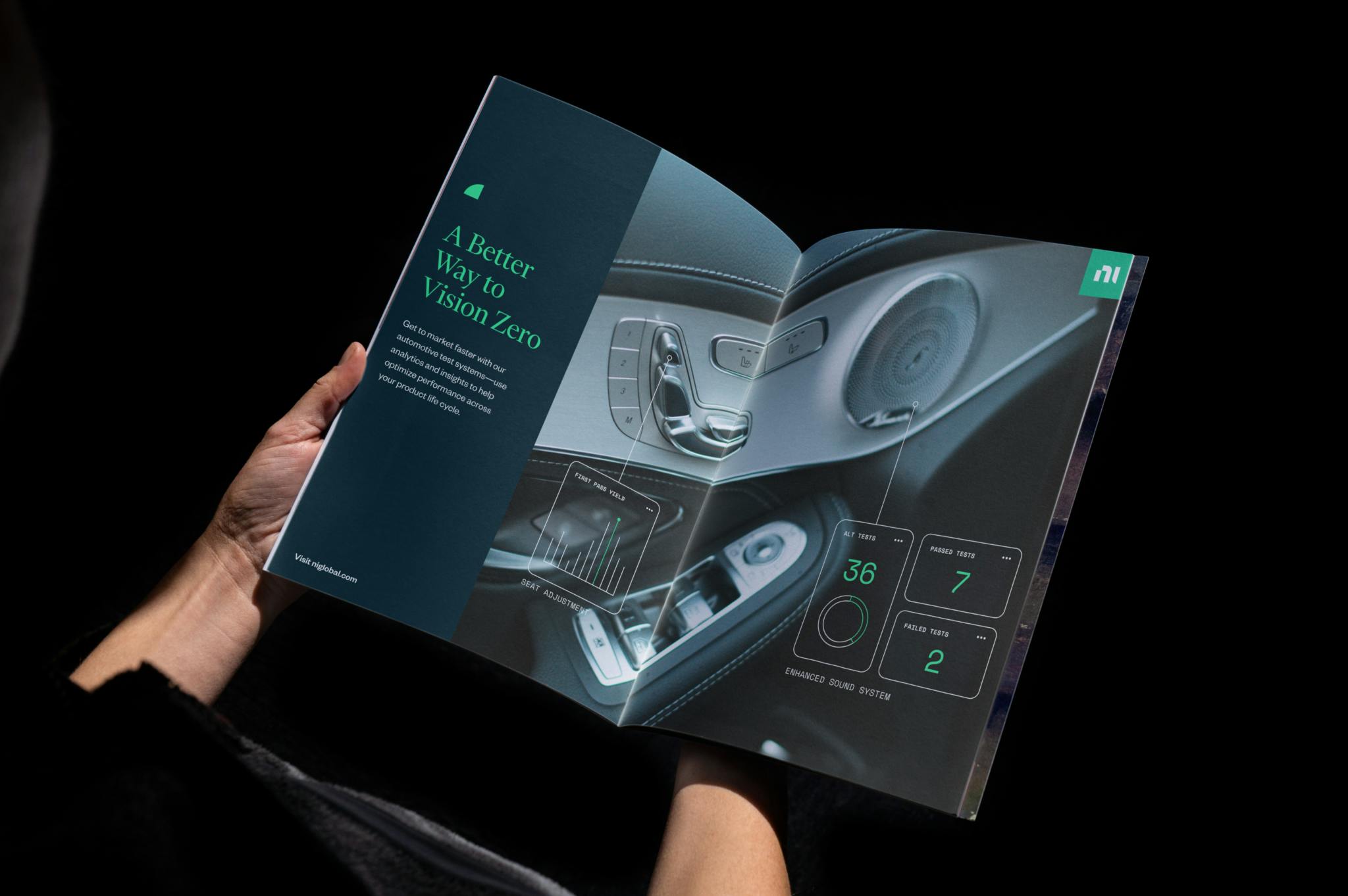
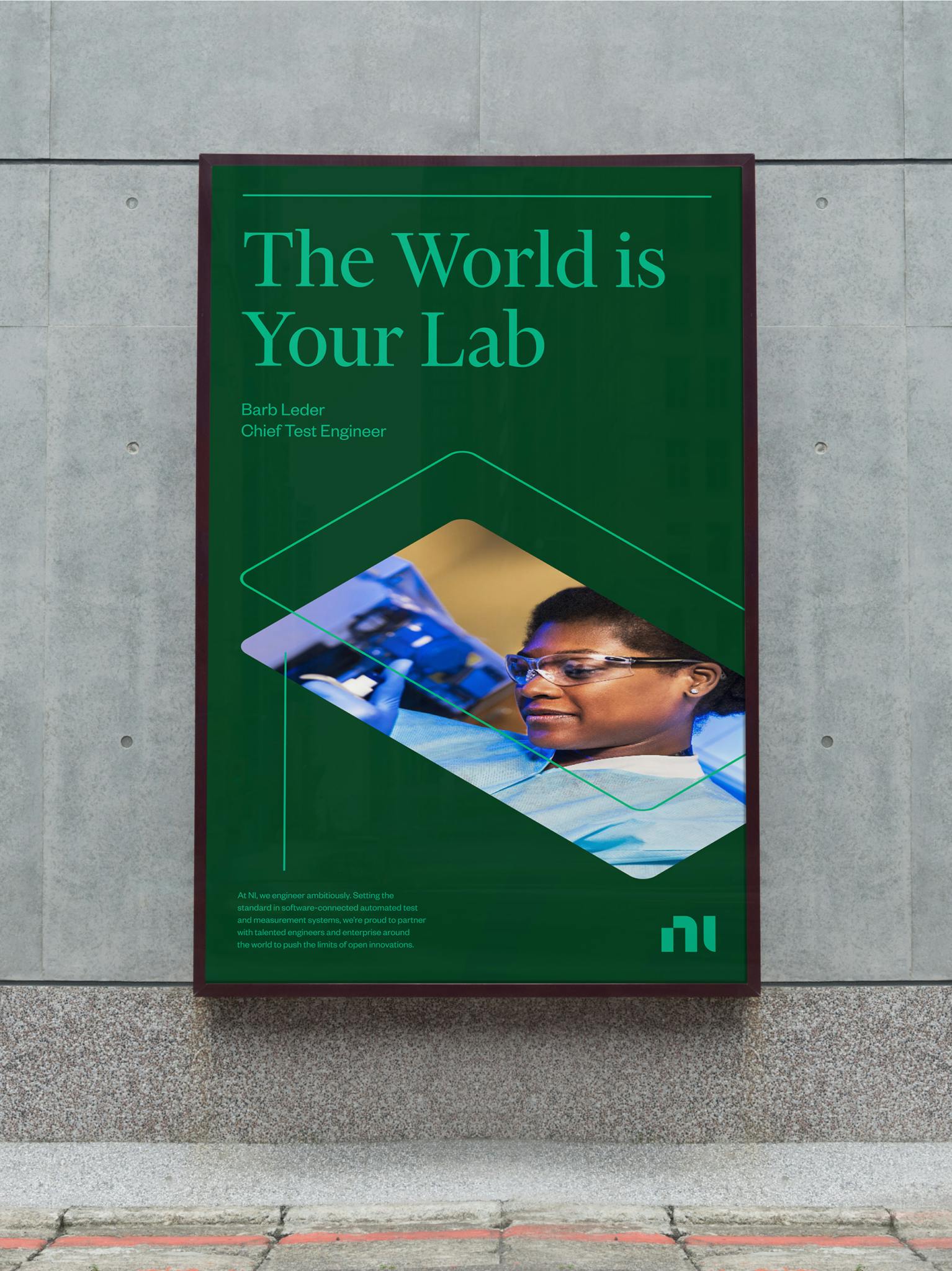
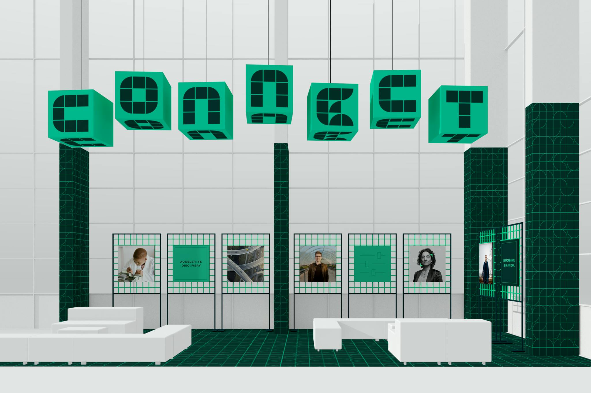
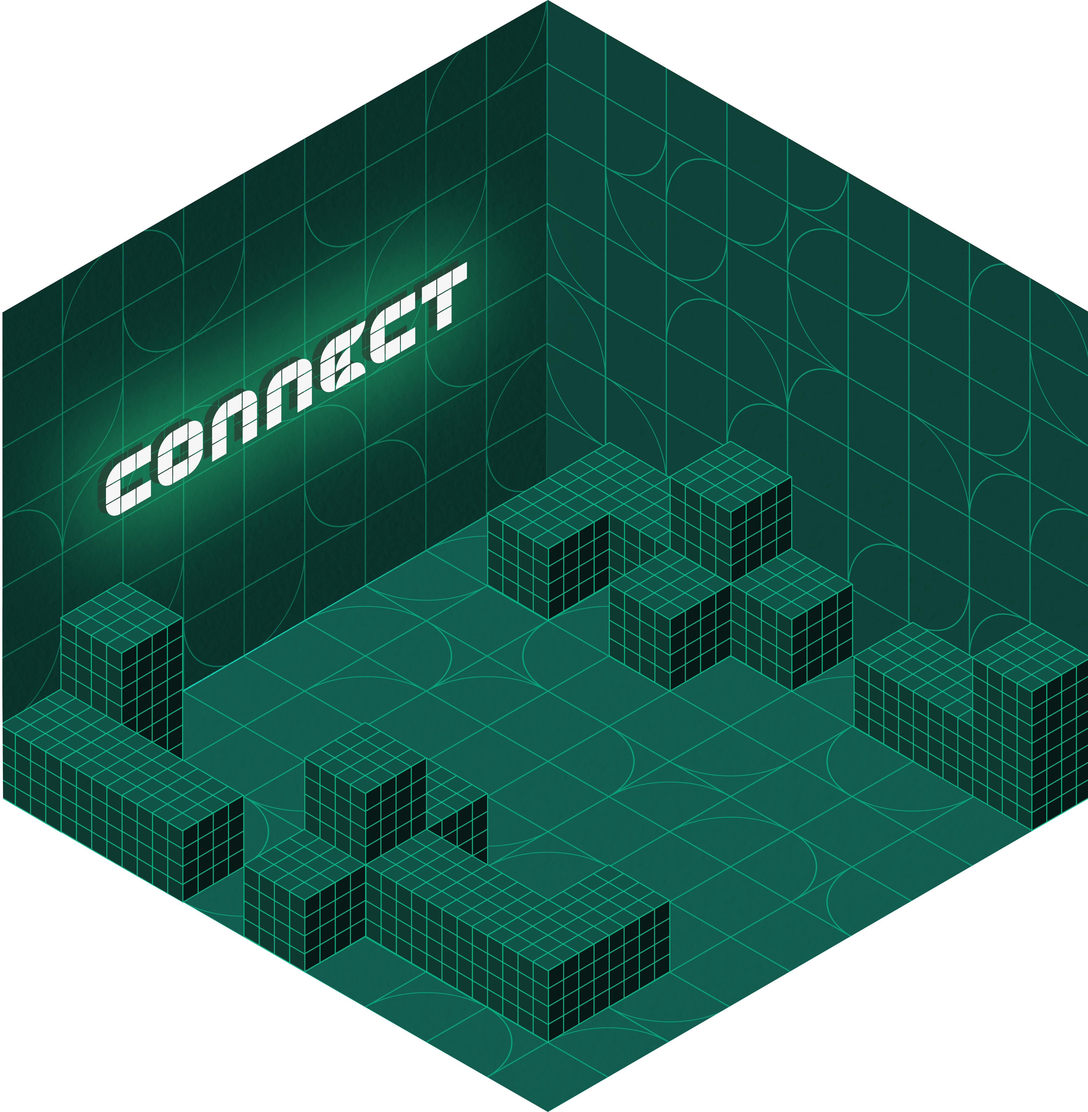
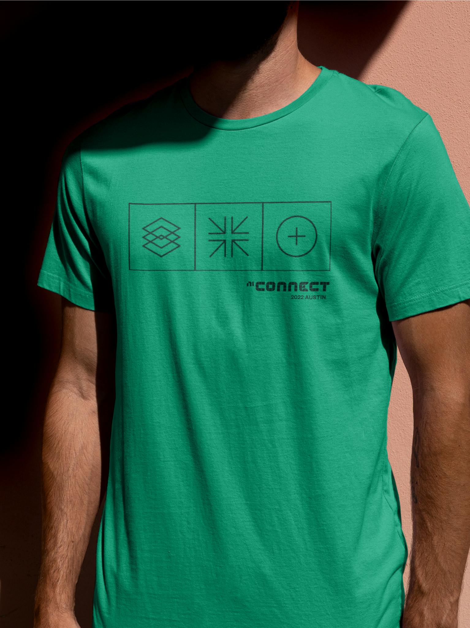
Out of this, we designed an identity for their annual NI Connect conference. Our approach was to bring another dimension to the brand, immersing attendees in a highly digital and memorable space that celebrates the engineer.
A system that scales
We designed the conference entry points and transitional experience moments at their Austin, TX event. This included a combination of wayfinding, supergraphics, and space activation assets that were used on-site (and beyond).
Next project
Miko
