Miko
Visual Identity & Launch Campaign
Miko is a STEM robot toy with a quirky personality that educates and builds lasting friendships with kids. Like a best buddy, it understands and responds to a kid’s world, instilling feelings of companionship to build confidence and encouraging creative interactions that are individual to every kid.
While the toy was already popular in India, the Miko team and Mega collaborated to create a refreshed visual system and campaign in preparation for their first U.S. product launch.
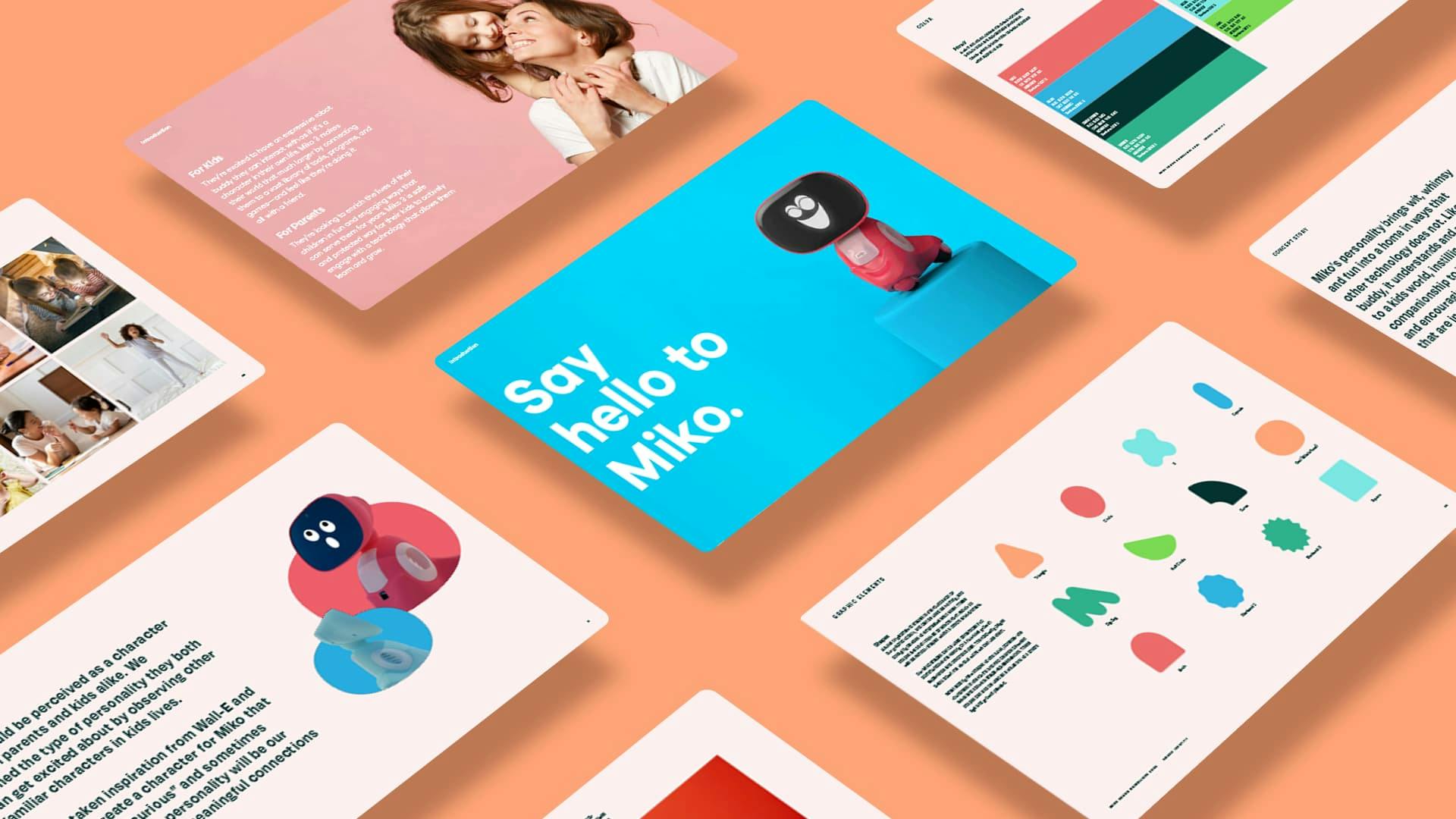
The brand amplifies the expressive nature of Miko’s behaviors, told through a system of shape graphics that emulate its iconic, rounded form factor while also drawing inspiration from familiar shapes found within a kid’s environment. This system was used as collage and framing elements combined with photography to communicate nutritive growth and childhood play.

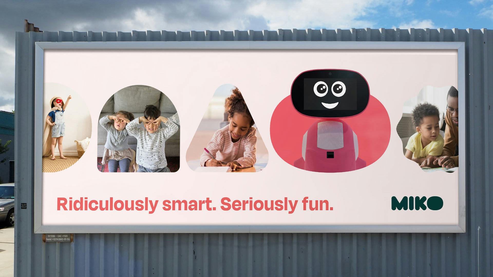
Ridiculously Smart. Seriously Fun.
When positioning the brand, we made sure that Miko was perceived as a character to both parents and kids alike. We defined its personality by observing other familiar characters within kid's lives, taking inspiration from Wall-E and BB-8 to create a character that is 'smart', 'curious' and sometimes 'goofy'. Miko’s personality was our power to create meaningful connections with our audience.
Now that we had a personality and a brand, we needed to create a campaign strategy that showcased the beneficial experiences that Miko, kids, and parents can share beyond the school walls.
Next project
START.GG