Vacasa
Brand Identity & Art Direction
Innovative technology, and localized service on a global scale, allowed Vacasa to become the second largest full-service vacation rental company in the US in less than 10 years. With rapid growth and business success over that time, they needed a more robust identity system that could reflect their ambitions and mark their evolution as a brand.
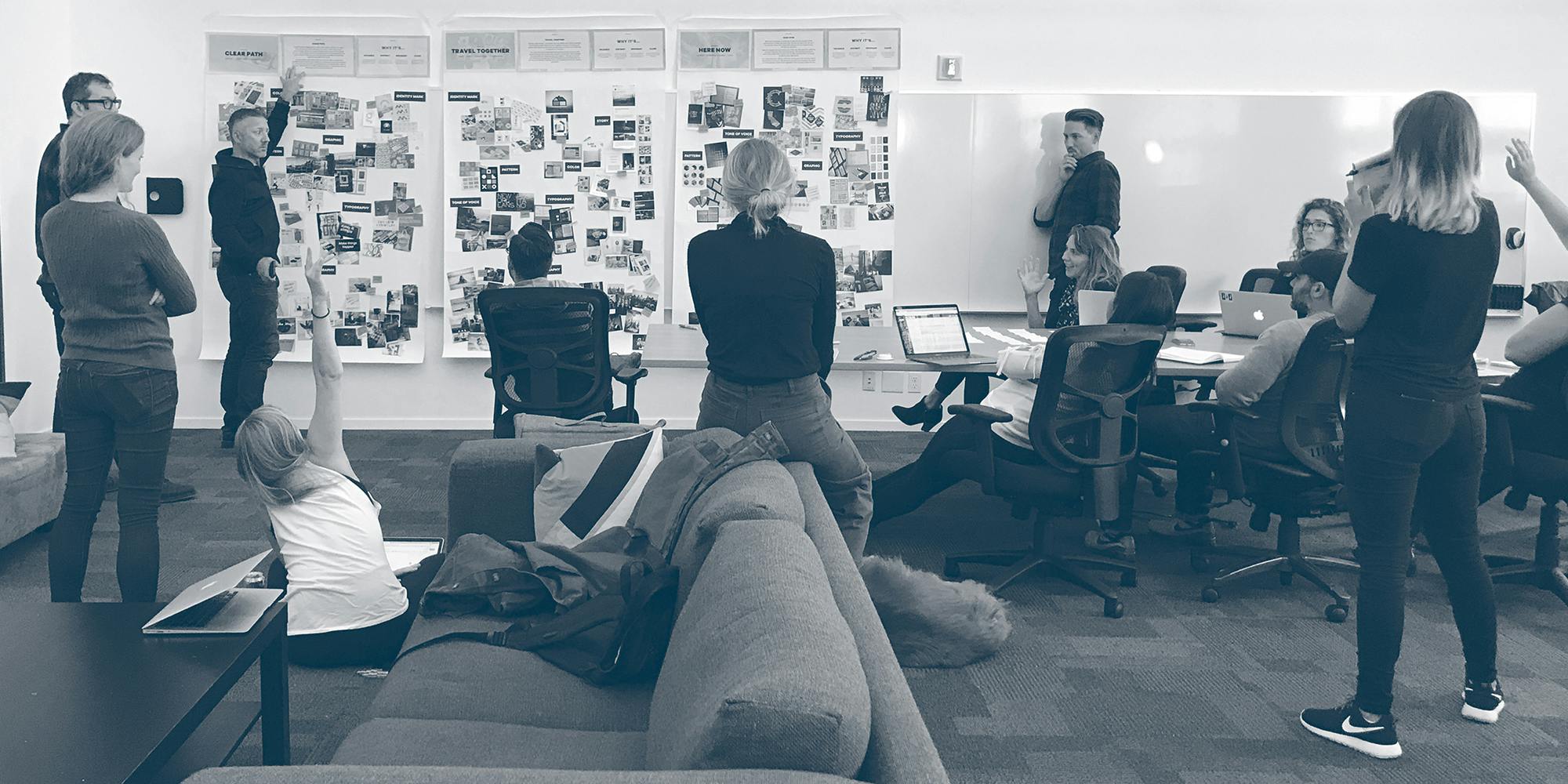
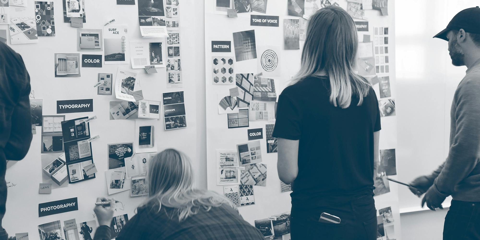
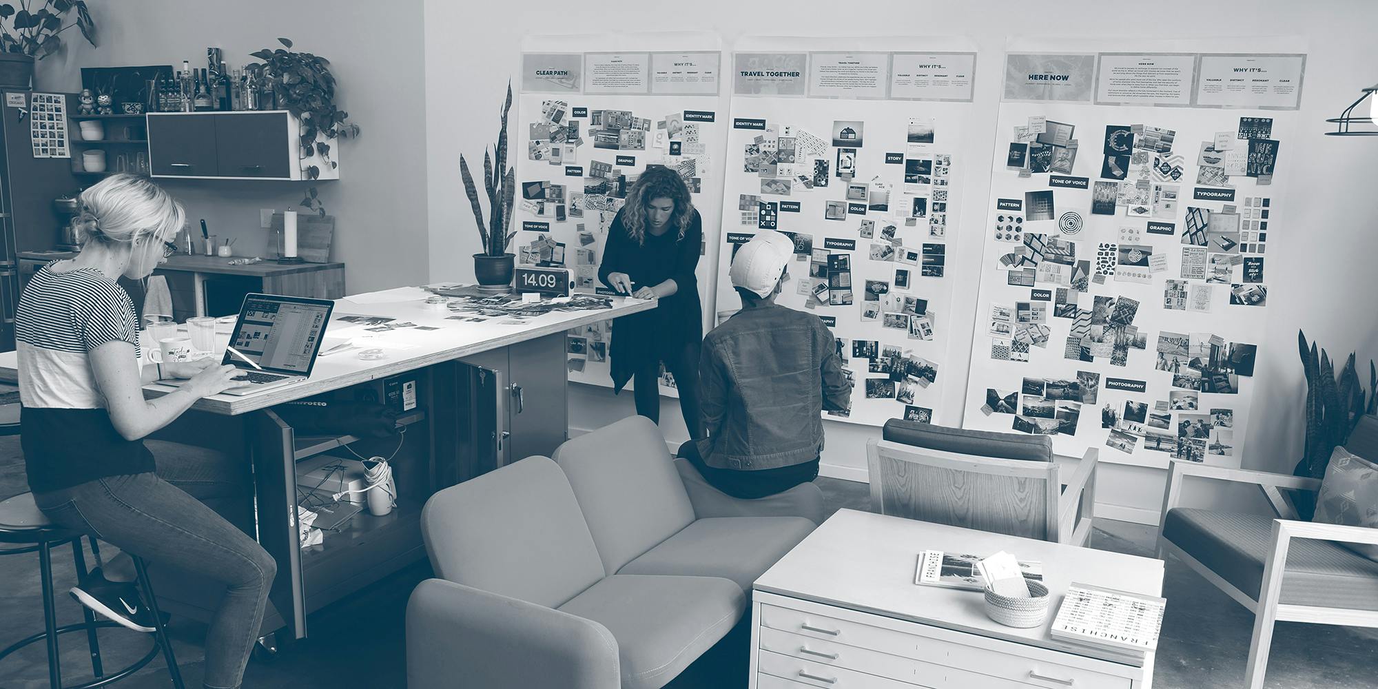
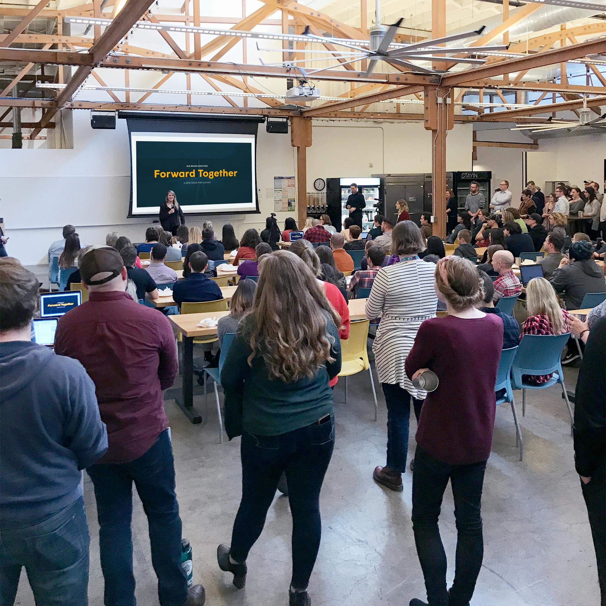
Fierce collaboration
In close collaboration with Vacasa leadership, we built upon their current brand platform, creating new design principles and an overarching identity system that reflects their brand today while remaining flexible enough to grow with them over the years.
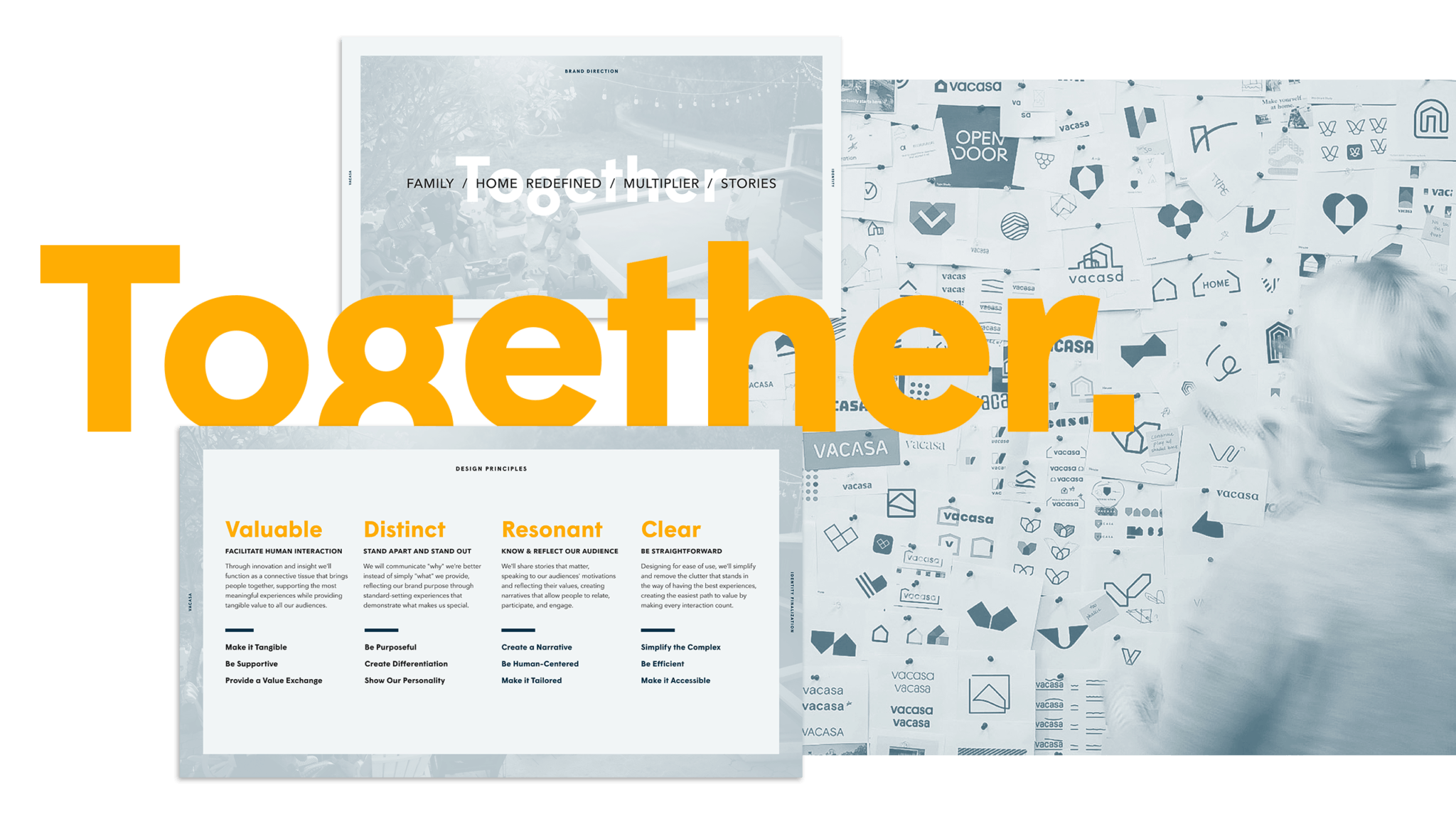
Out of our strategic and creative exploration of the brand, we established a central theme that became the spearhead of our creative direction—"Together”—an idea that underlies all facets of the new identity system.
This fundamental theme allows Vacasa to tell distinct and human-centric brand stories through the experiences of their multiple audiences—guests, homeowners, employees.
The identity was built to represent guests, homeowners, and employees of Vacasa—embodying their purpose of bringing people together.
Personifying home
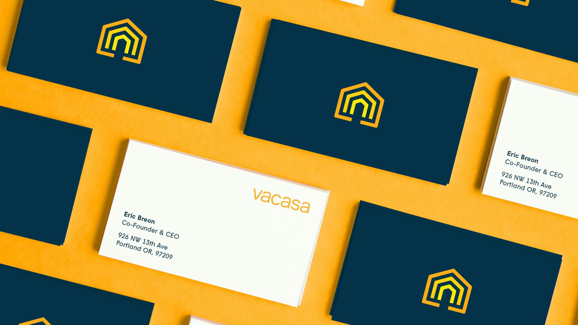
The logo mark was designed to represent more than a home—it symbolizes Vacasa’s role as the foundation of support for their guests, homeowners, partners, and employees. It represents the diverse people, places, and experiences that they work to bring together, and embodies a doorway to ease, reliability, and possibility.
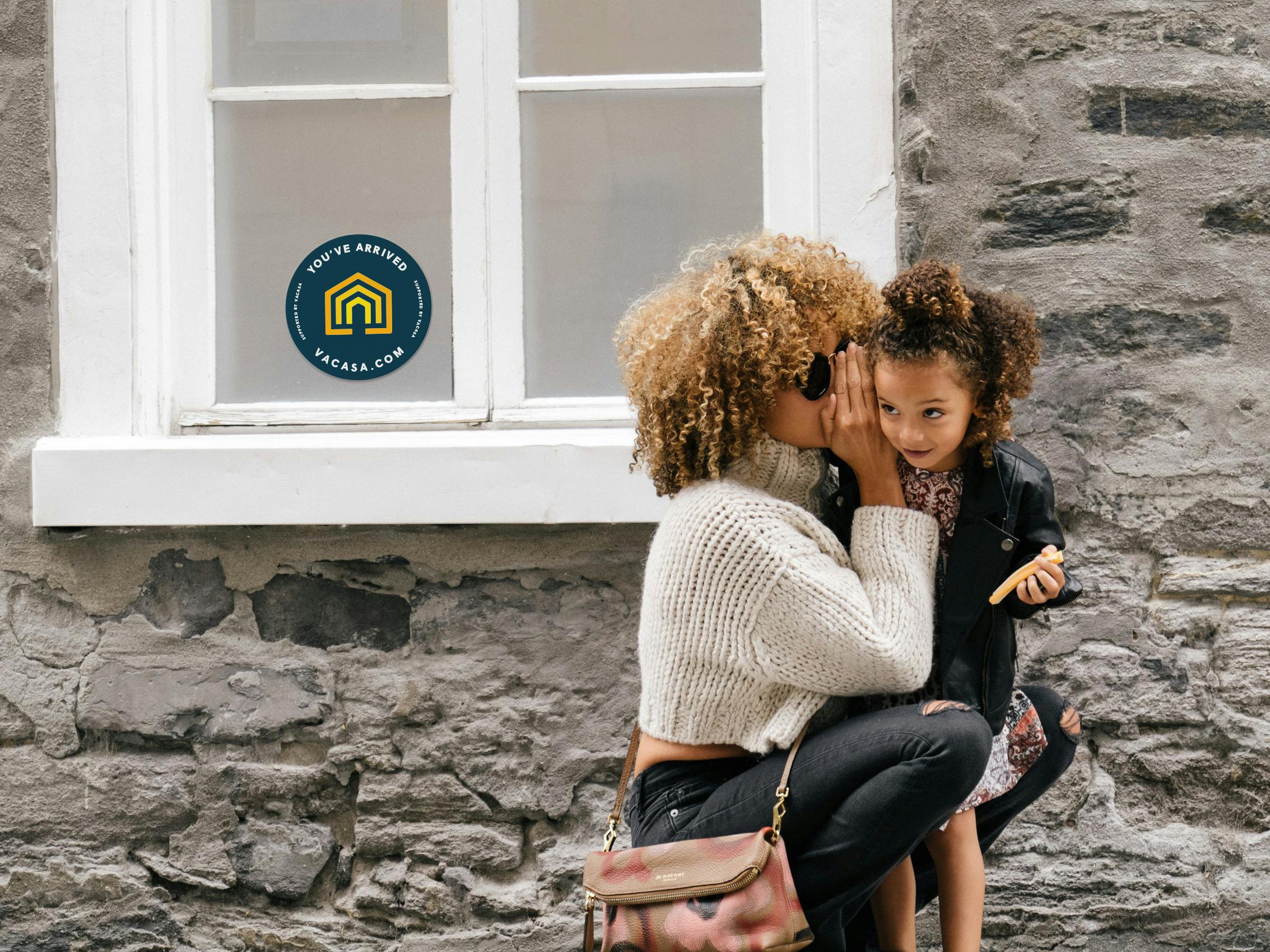
As a service that puts people first, we wanted our work to show how Vacasa commits to creating and delivering experiences that assure their customers that they are always there to support them.
Our expanded identity system was built to be open, welcoming, and connective, ensuring that every interaction with Vacasa feels like a genuine human connection.
Warm and harmonious colors take cues from the company’s roots, and create a spectrum representing the multiple contributors that come together in a Vacasa experience.
Typography blending a strong architectural geometry with interesting cuts and angles strikes a balance between clarity and character, charming and friendly while maintaining functional.

Vacasa is more than just rental home management; they offer a highly extensive suite of services used to create personally tailored experiences, all while providing hotel level amenity. To capture this, we took care to emphasize personal narratives and human-focused stories, the big and the small, the intimate and inspiring—all the moments that make a Vacasa experience a memorable one.
Tools to thrive
As our design process drew to a close we created a flexible and robust set of guidelines that can grow with Vacasa, and evolve as swiftly as they do.
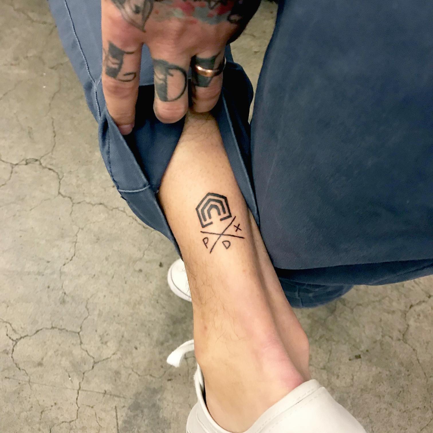
The excitement at Vacasa for the new brand is strong enough to inspire permanent body art, and we can hardly wait to see where they're headed next.
Next project
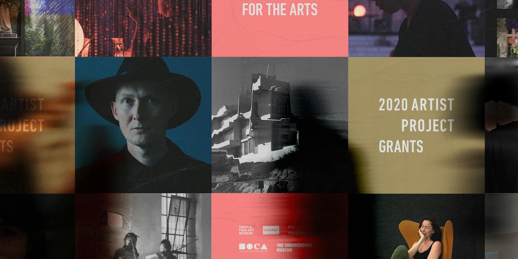
Mike Kelley Foundation for the Arts