SPC/LST
Brand Identity & Art Direction
Mega partnered with SPC/LST, a high-level tech pack and apparel company started by outdoor and adventure industry veterans to create a brand identity in an outdoor category that defaults to the expected.
Based on a deep dive into SPC/LST’s ethos and production methods, we collaborated with our partners to create a clean and utilitarian design system, paired with a raw and artistic photo style. What we ended up with is a brand identity that lives in the outdoor category without getting lost in the weeds.

Building the Brand
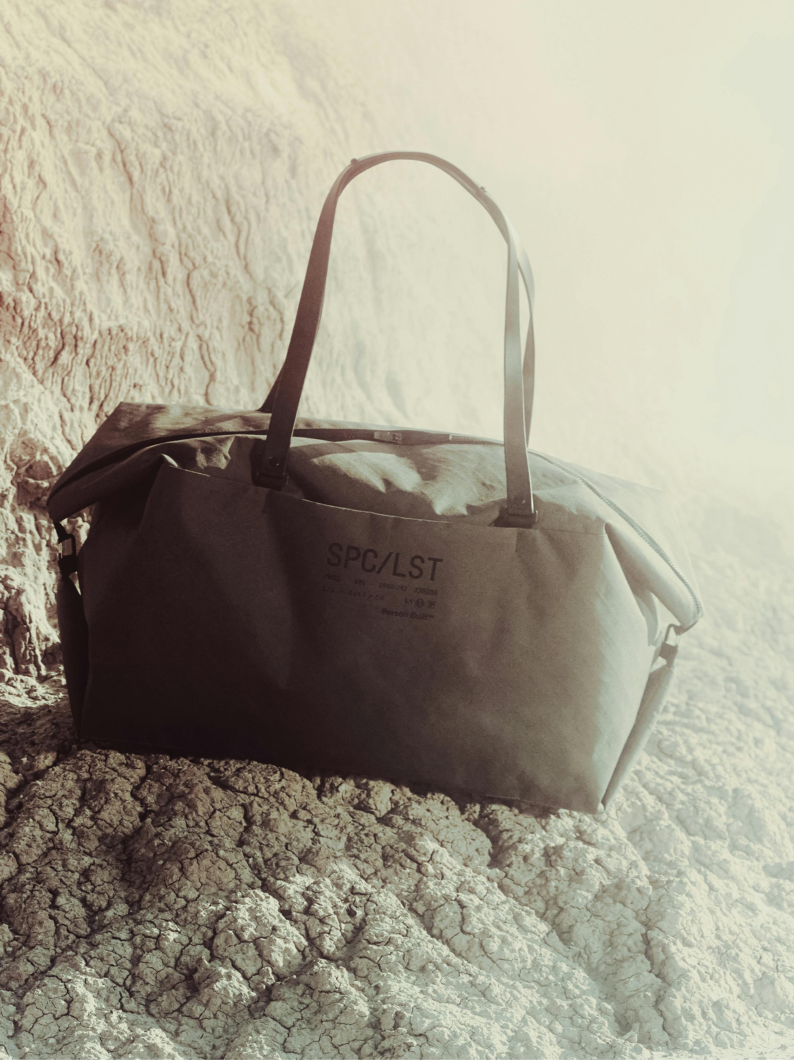
Our aim in creating the SPC/LST brand was to strike a balance between craft and creative. SPC/LST is a brand that balances practicality with pinnacle level quality and precision, meant to flow smoothly from an airport to otherworldly adventure. The look & feel we created was meant to be timeless, able to traverse these worlds effortlessly with utilitarian typefaces, a functional color palette, dynamic imagery for product and model, and video style that could be anywhere from Northern California to Mars.
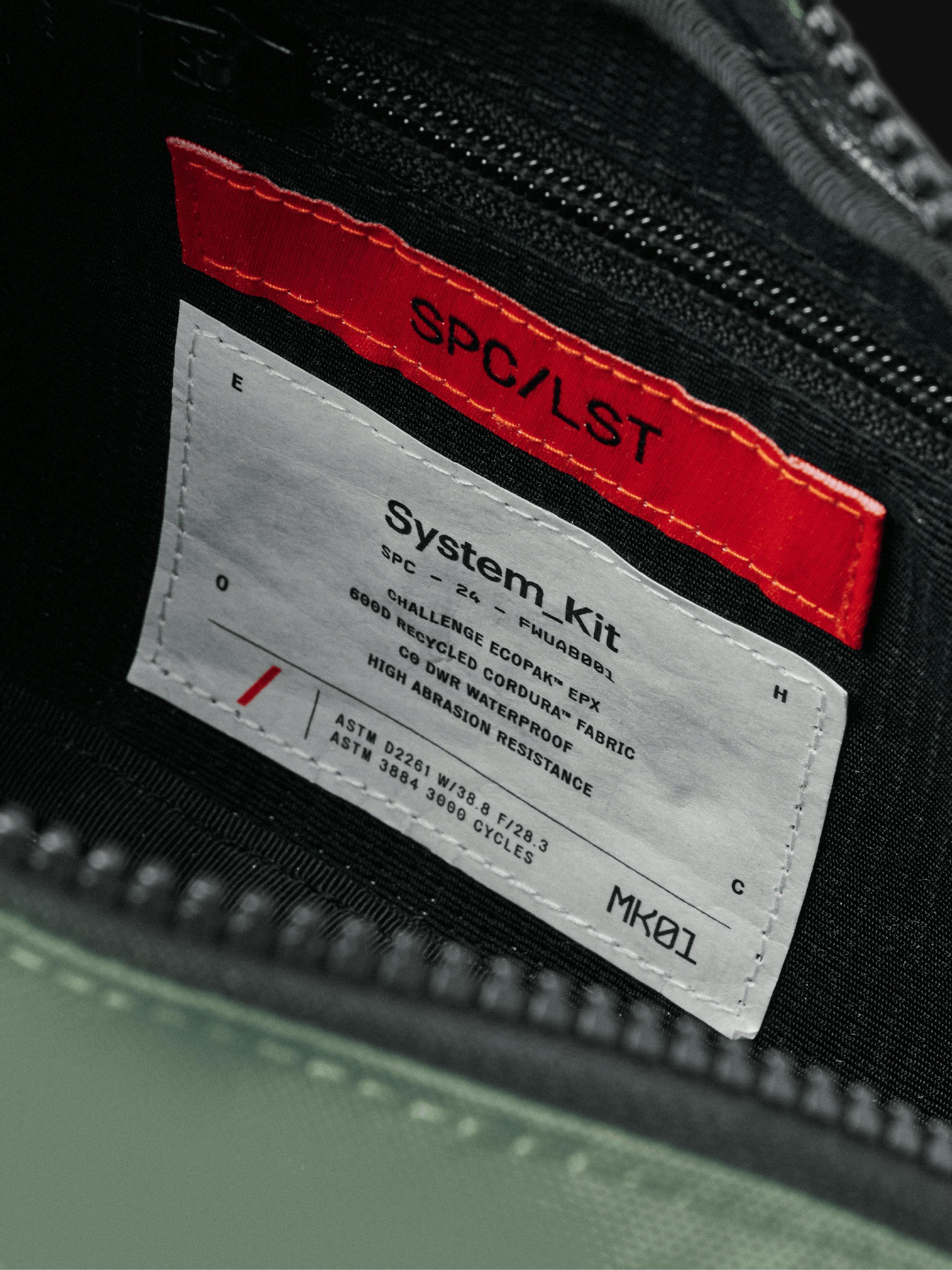
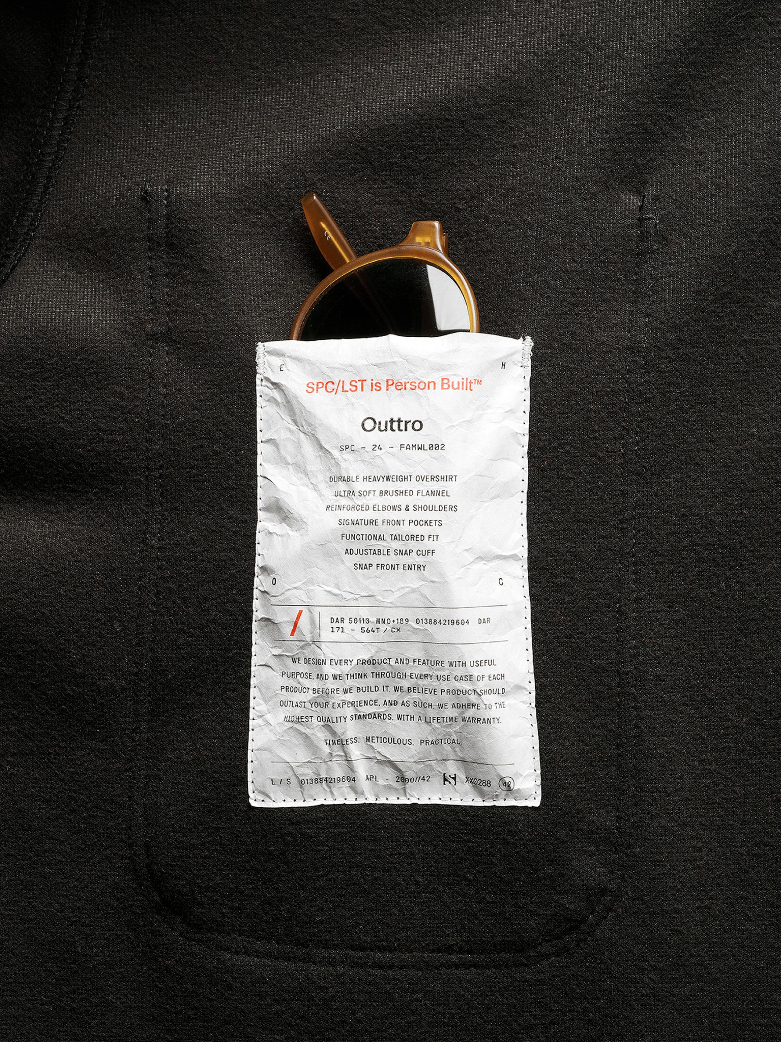
Gear to Outlast
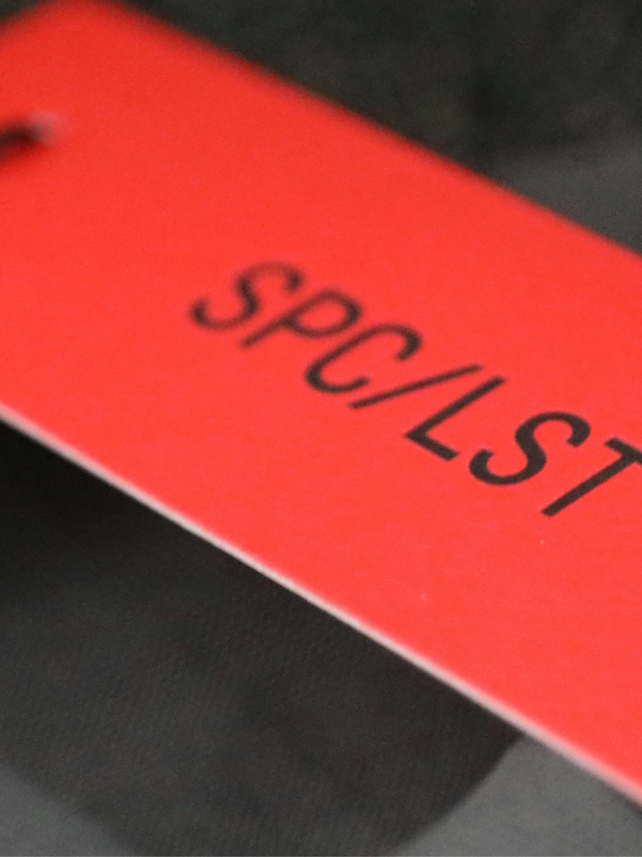
Born from utility, we used labels and tags themselves as the design language, bringing the material and item detail to the front, with SPC/LST Red used throughout to highlight the brand, itself. Just as the visual system is rooted in utility, we continued that thread using labels themselves as functional aspects of the product.
Creative Partners
Photo/Videography: Mason Prendergast, Jay Kolsch
In partnership: Tyson White, Danny Geary
Next project
Snap Sports Network Live