KEX Portland
Brand Identity
KEX began as a social hotel/hostel in a once-dead neighborhood in Reykjavik, born out of a passionate group of people and their desire to bring adventure, community, and a touch of irreverence to the hospitality industry. Looking to expand and evolve their brand for a US market, they came to us after selecting Portland to be their first outpost.
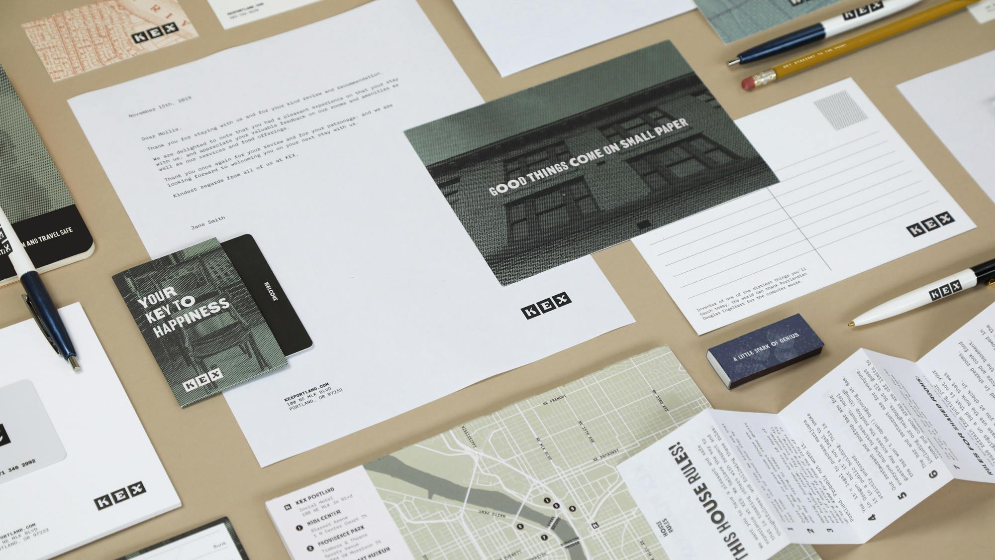
Starting with our foundational strategy and extending through both physical, printed, and digital touchpoints, we infused the new identity with many of the same things that makes KEX Iceland so strong—a sense of community and place, a love of collaboration, and an expectation of the unexpected.
Together with KEX teams from both Reykjavik and Portland, we worked to develop and build a scalable identity system that can evolve with KEX as they grow and expand beyond their Icelandic roots, moving the brand from a local treasure to an international fixture without sacrificing what they stand for.


Celebrating context
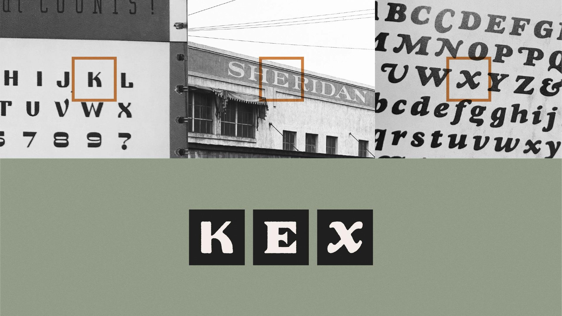
With the framework of the original brand as a starting point, we worked to bring the same anchor to local history to the newest KEX identity. The evolved mark was created with American type references from several different eras – and then composed into a mark that feels distinct to a place and its history.
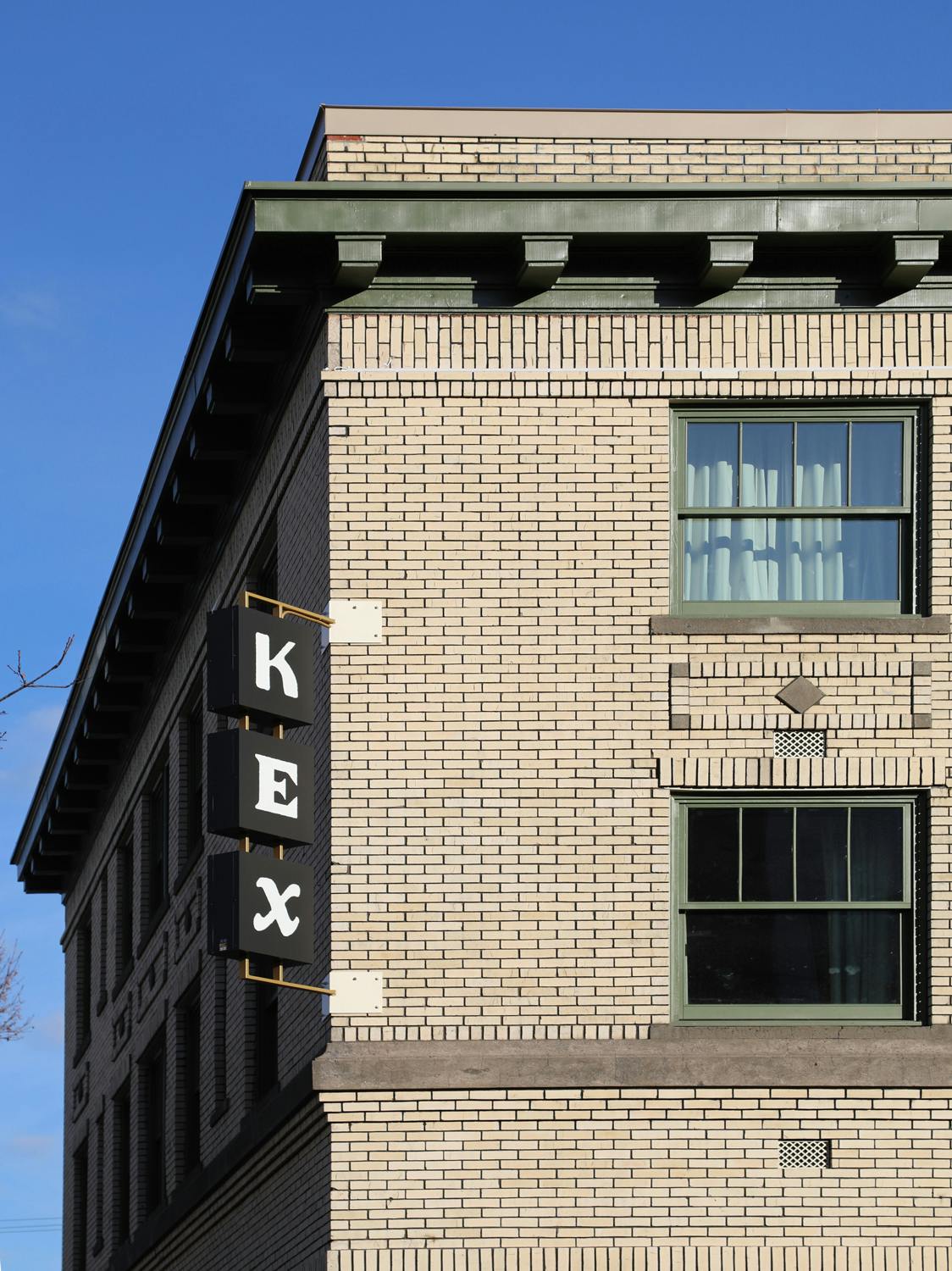
Taking cues from the interior design work of Halfdan Pederson and the bones of the building’s historic structure—over a hundred years old and one of the first mixed-use developments in Portland—we introduced a warm and rich textural palette that reflects the materiality and personality of the space.

Everything from our typeface choices to our photography treatment is an homage to the eclectic character of our city—capturing the people, places, and things that make our city and turning them into the textural backdrop of the brand itself.
Expecting the unexpected
A large part of the KEX experience is about possibilities — possibilities for creating moments that are fresh and exciting, that go off script and keep curiosity and adventure alive. We instilled this wherever possible throughout our brand collateral finding new and surprising ways to present more traditional hotel and hostel materials, whether through the use of an easy-going tone of voice or non-traditional formats and materials.
Analog Brand. Digital World.
When crafting the online presence for KEX Portland, our goal was for it to feel just as rich and tangible as the space itself. The site is designed to be highly functional, and yet unconventional at the same time.
One of the more expressive elements of the site is the landing page, which we designed as an interactive experience that encourages the user to explore and discover at their own pace and direction. The result is something that captures and communicates the unique feeling and texture of the KEX experience.
Check it out for yourself at kexhotels.com
We knew from the beginning that conversions were super important, so we needed to make sure bookings were always just a click away. Our solution was a fun little sticky button thats always there and expands with a playful wink.
No nonsense functionality was a priority from the beginning. Our ever-present navigation drawer ensures people can explore without getting lost.
Mobile was always a priority given that a lot of travelers in the target audience would be booking on the fly. So the design challenge was to make sure the experience on mobile was just as functional – and expressive – as desktop.
It pushes the envelope on design and functionality and is a fresh approach that we think really captures the essence of the space and brand online.
Creative Partners
Special thanks to Hálfdan (Dani) Pedersen: Interior Design, Mikael Lundblad: Photos of interior, and 14four: Web development.
Next project
L’Angolo
