Holler
Brand & Environment
When some good friends came to us, they were in the dreaming phase of their latest restaurant concept. They had an award-winning chef, a neighborhood hungry for something new, and a great space to hold it all.
With an ambitious plan–part sports bar, part restaurant, private dining areas, a take-out window, and an arcade–they needed a story and an identity to support it. All centered around insanely, delicious fried chicken.
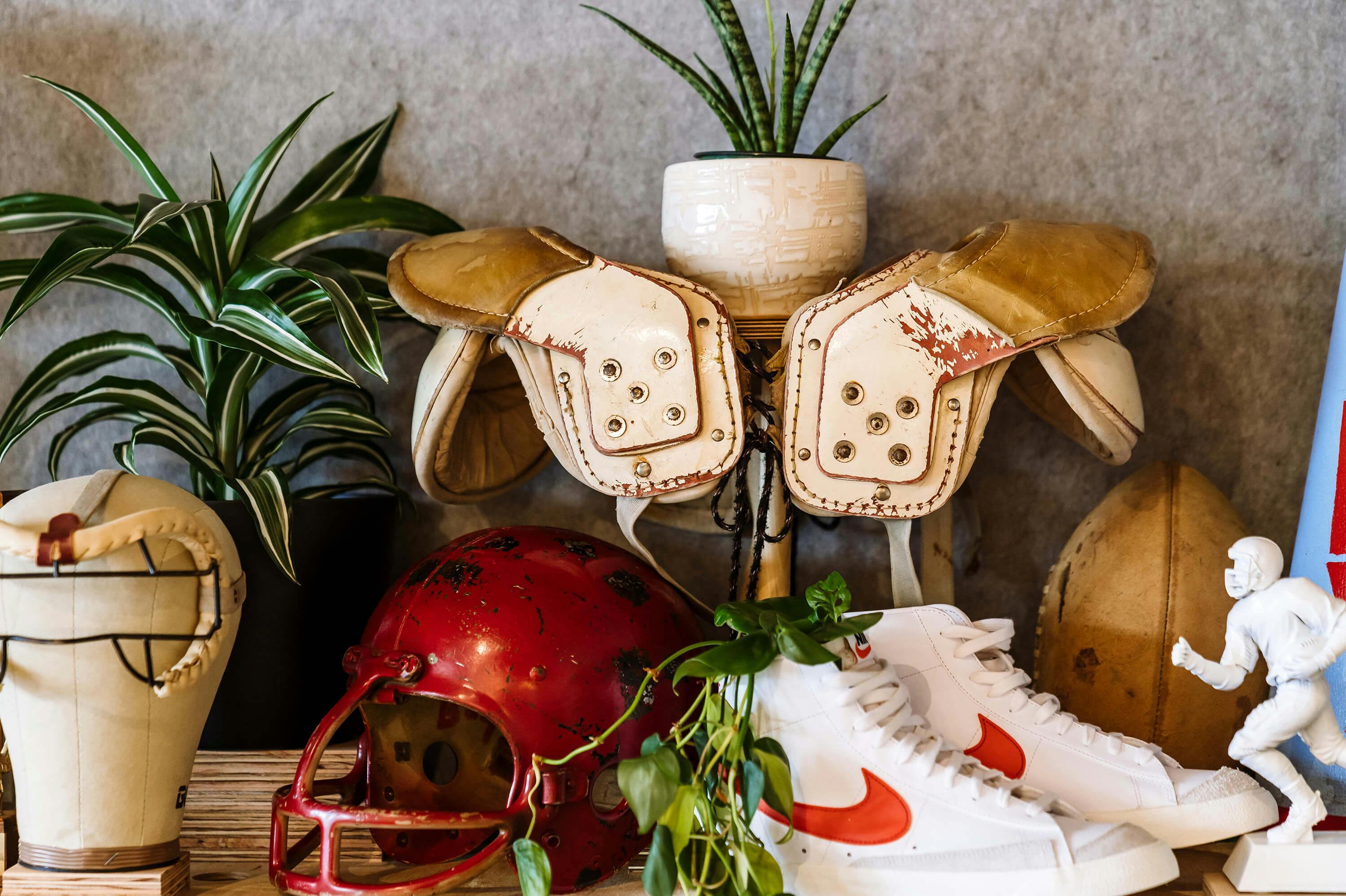
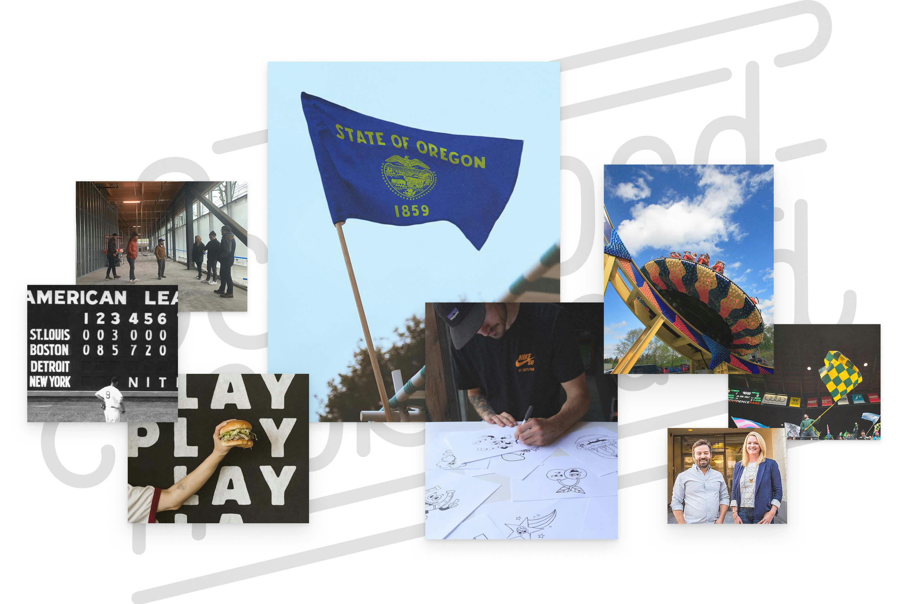
Excited to dig in, we began by mining inspiration from the Sellwood neighborhood, including local wildlife and attractions. We envisioned a fun, sporty yet polished vibe that felt inviting and genuine. A versatile gathering place that filled the niche for all kinds of folk. Nothing pretentious or highbrow.
- Brand Identity
- Environmental
- Art Direction
- UI Design
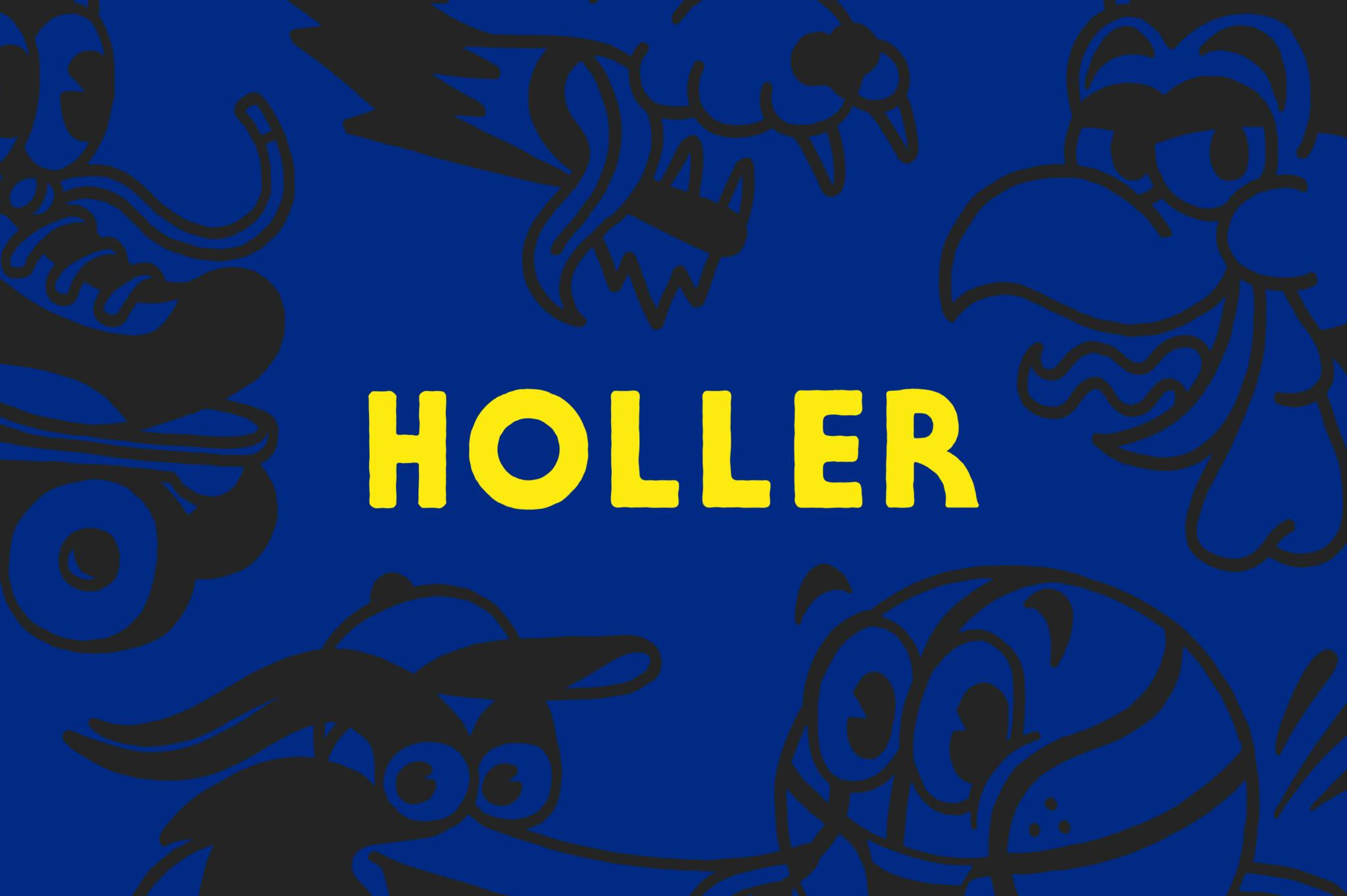
Beyond the core identity, the toolkit features illustrations of various local “mascots,” an array of badges, lockups, and wayfinding elements while our color palette was influenced directly by the Oregon state flag.
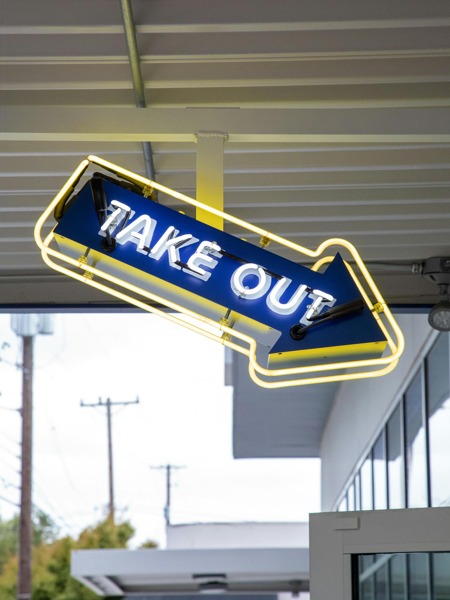

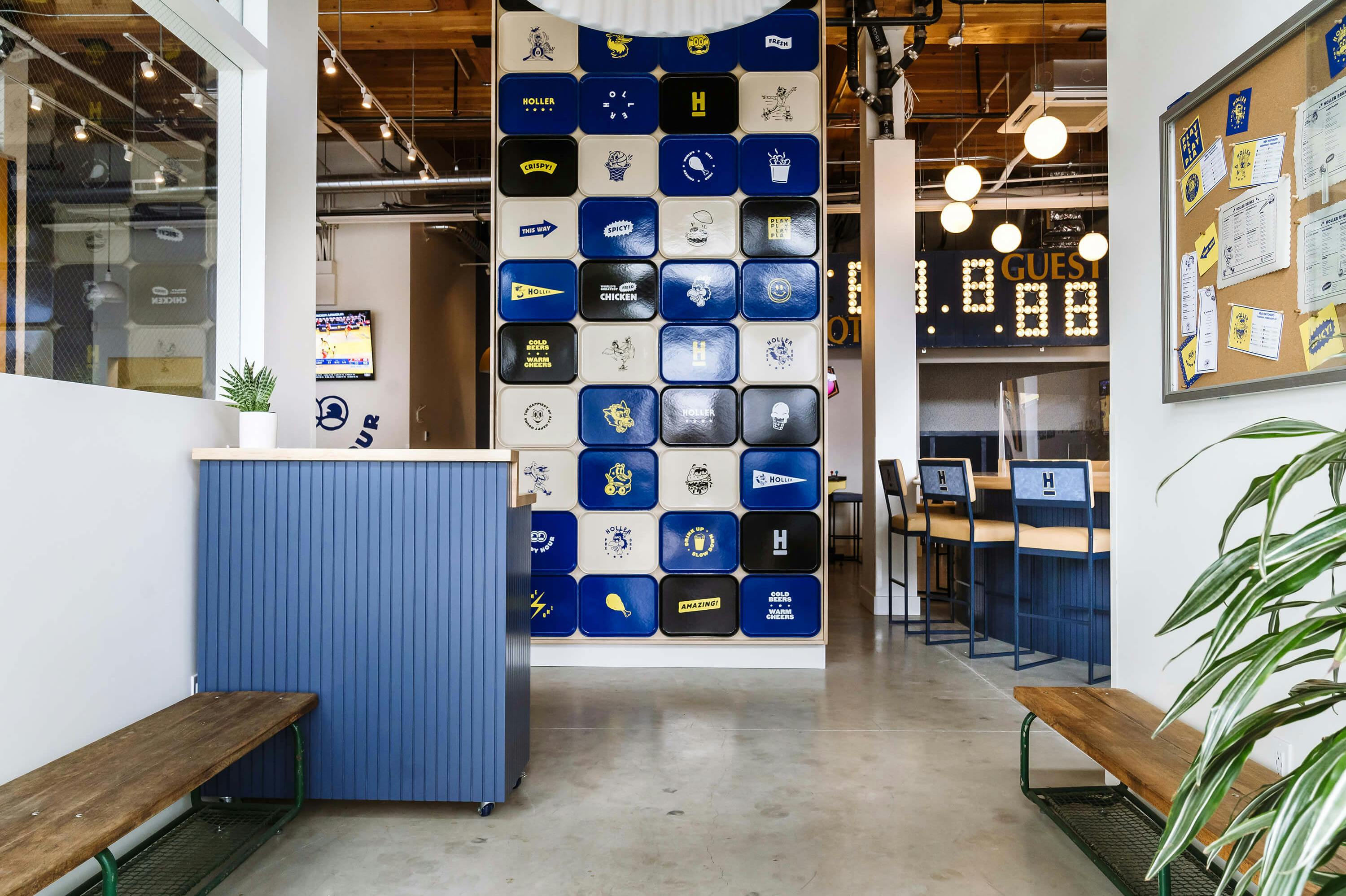
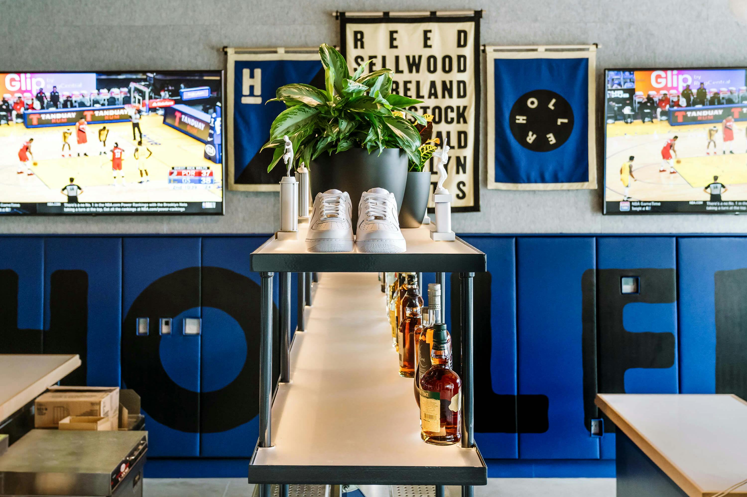
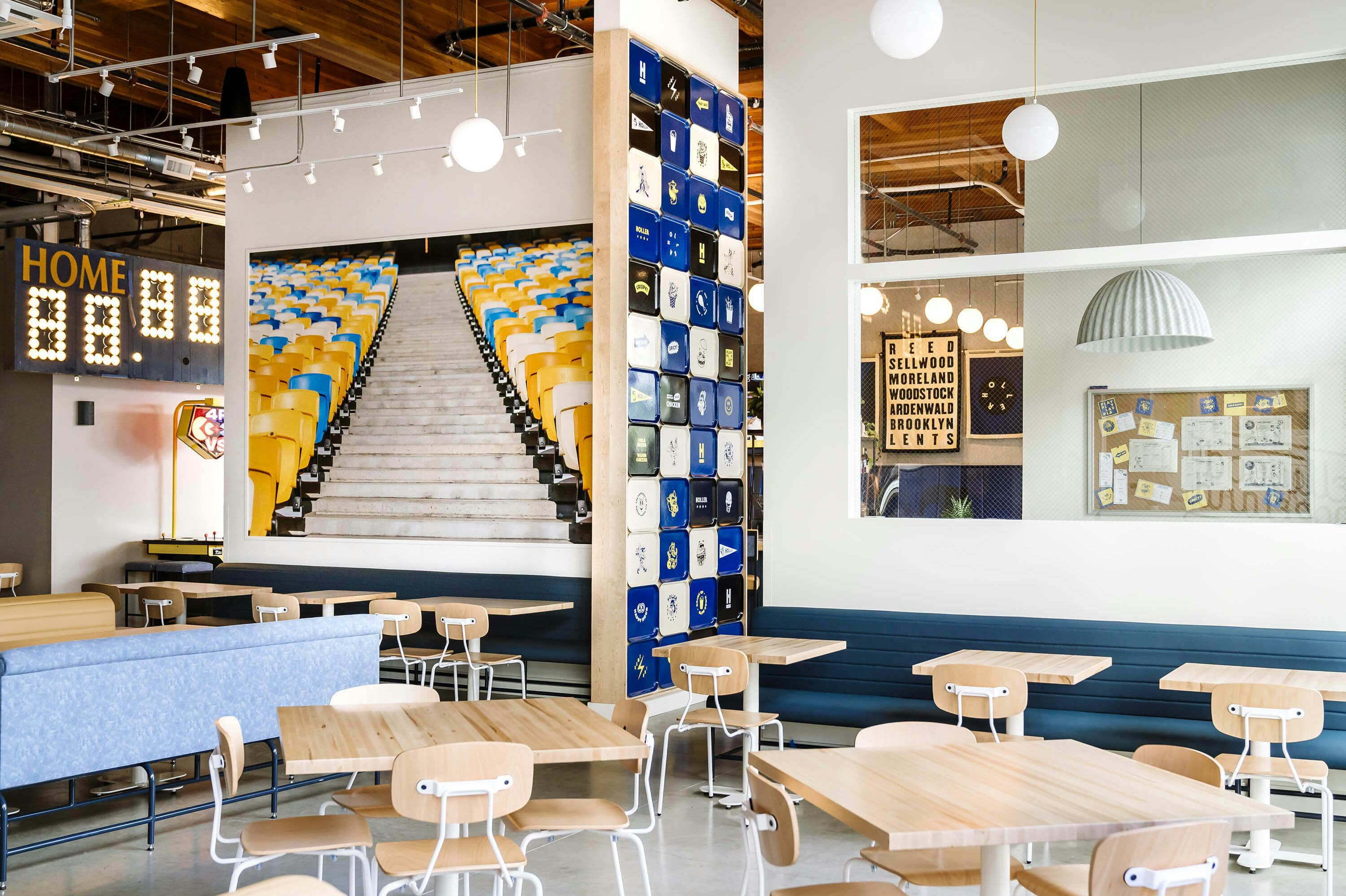


In addition to the visual identity, we also led the effort on brand experience within the space. Before the walls even went up, we were helping to define where to locate key brand moments and how we could infuse the playful energy of the brand into the environment.
From there, we worked directly with the interior design and production teams to make it all happen


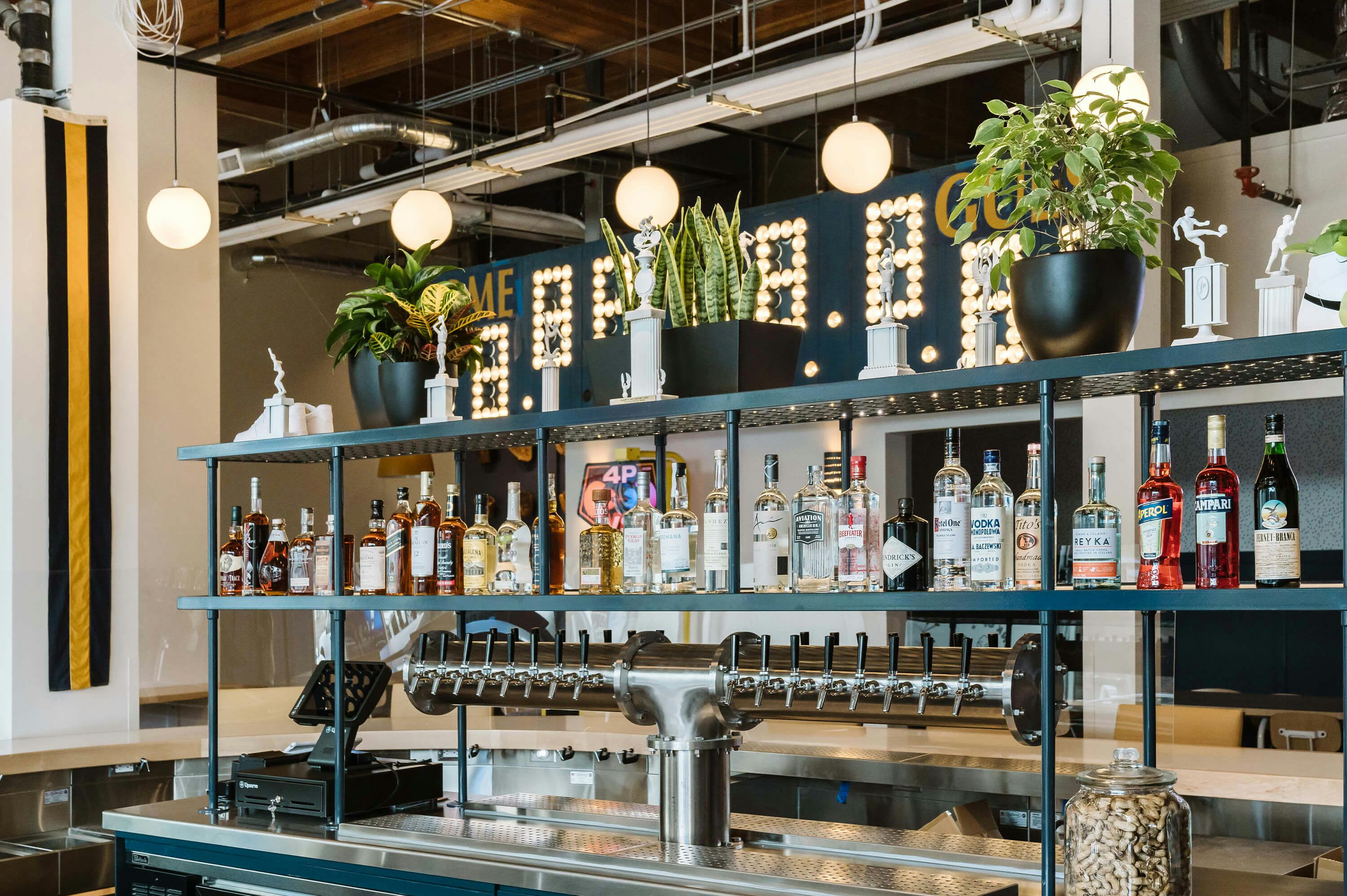
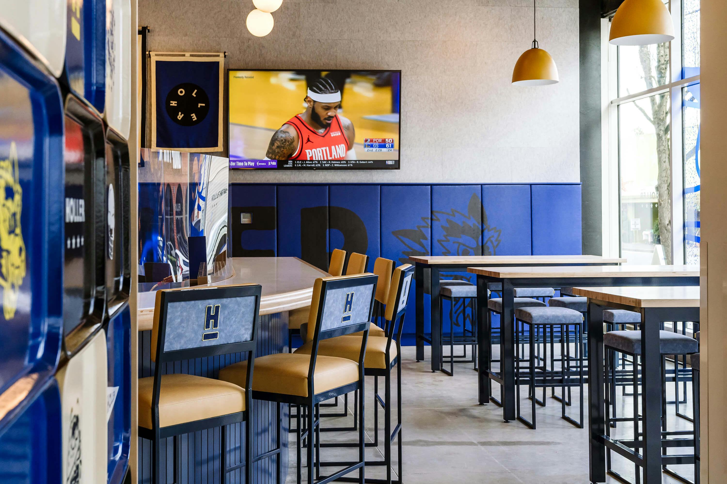

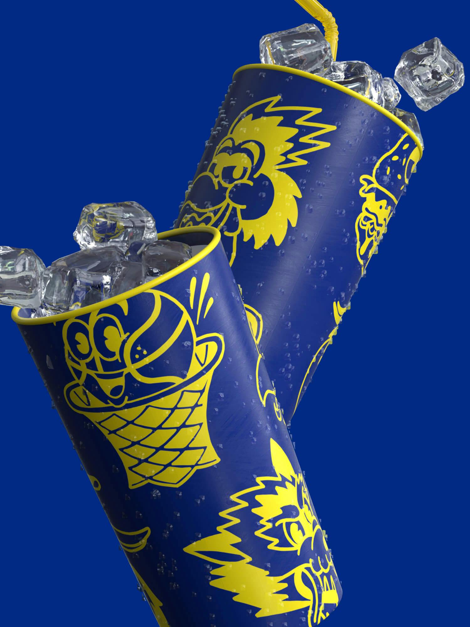
I really like the vibe there, I love the scoreboard and the art. Their tots are salty and they have a bunch of different sodas.

Digital
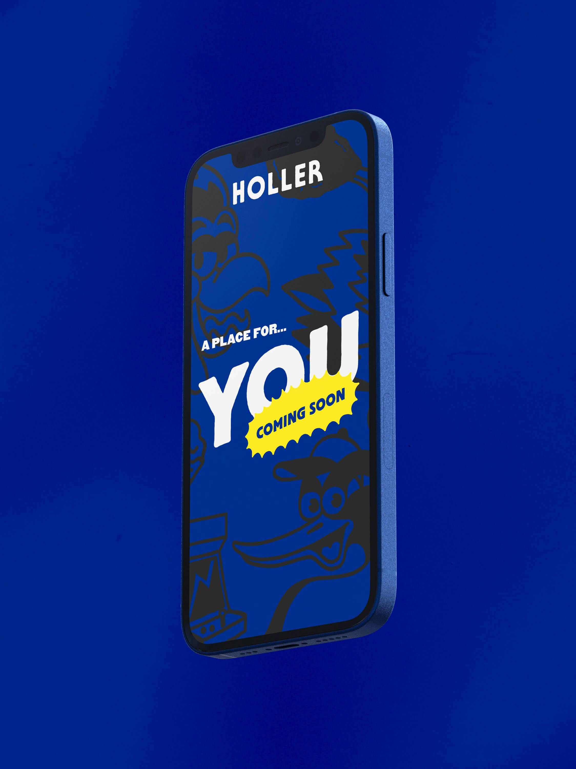
In the period prior to Holler’s grand opening, we began work on the Holler digital experience, first in the form of a simple teaser landing page displaying limited info. From there, we created a more robust dot com presentation, fully announcing the restaurant opening - equipped with menus, reservation instructions, online ordering details, and a bit of brand storytelling.

Food truck
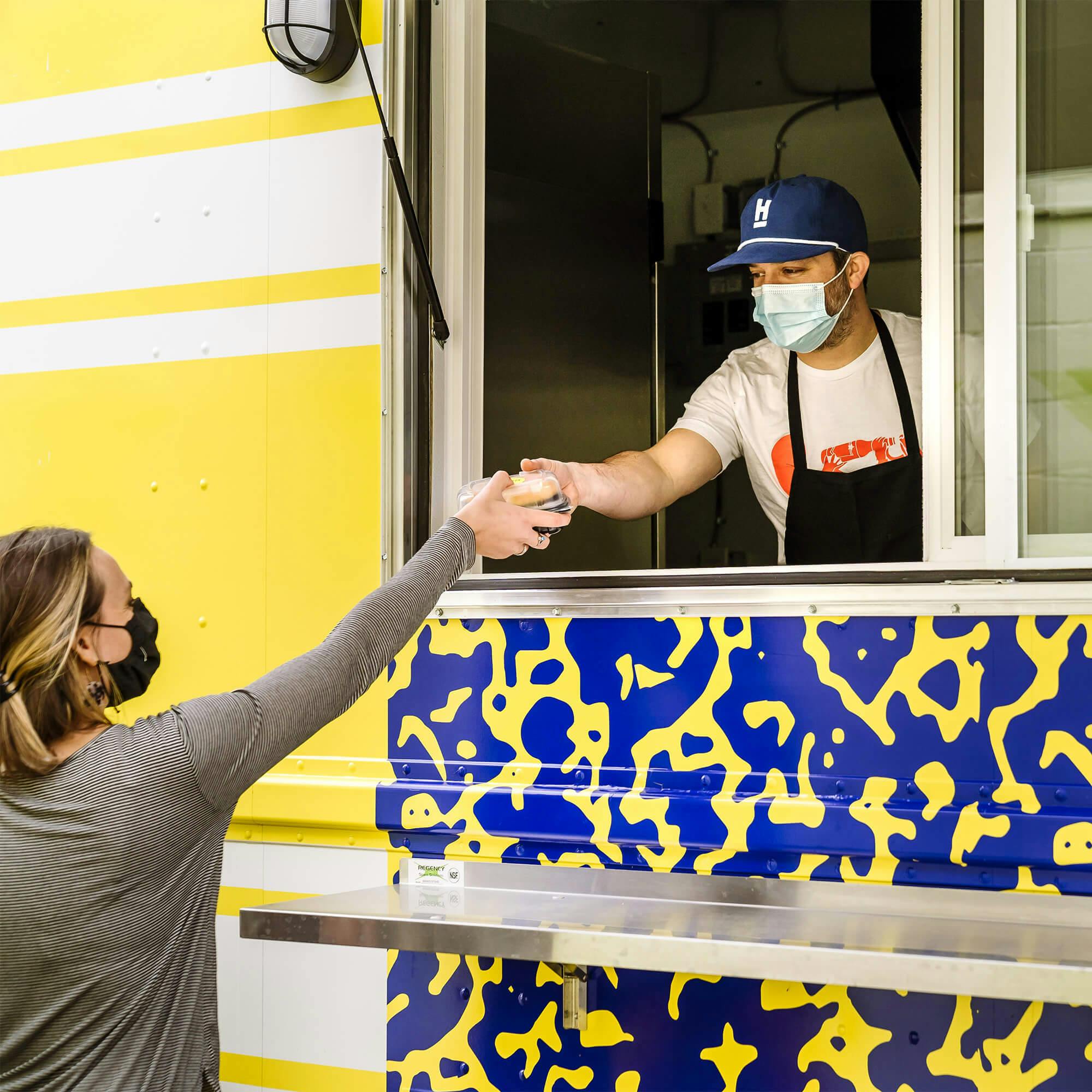
As the build out of the Holler space neared completion, our client approached us with the idea of creating a Holler mobile food truck, to pop-up at events and take the Holler experience remote. The truck was a blast to create, allowing us the opportunity to play with the visual language we had developed and to see Holler take the show on the road.


Sellwood-Moreland
With an intention to create a whimsical, sporty vibe, we also aimed to instill a sense of neighborhood pride in the artwork. Sellwood-Moreland is a charming, low-key corner of Portland, home to a migratory bird refuge and one of the oldest amusement parks in the country. We took inspiration from the Oregon state flag, local wildlife, and the ancient Oaks Park roller rink
Next project
Xbox × Shang-Chi
